Hello, it’s me again. I have two issues that I need help with:
-
I have some objects that moves when the page loads. But If I navigate back and forth between pages, the objects keep moving in that direction, going out of their original position (even going out of the page).
-
I’m struggling with making the objects at the top of the page stay where they should be seen. It seems that the position of the objects at the top is affected by the length of the page. For example, on a 900px long page, there is a blank space between the object and the visible top in the mobile view. However, on a longer page, the object sticks too near to the visible top. It feels like there is no respect for the borders and margins that I design. Why is this happening?
One
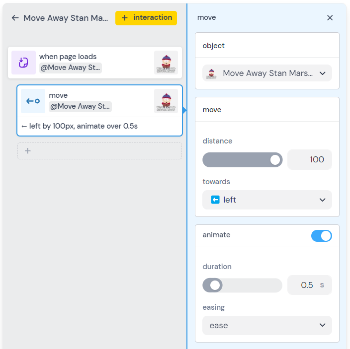
If your interaction says “when the page loads move this thing to the right 100 pixels” then it will continue to move 100px each time the page is navigated to (unless you reload the site / start a new session).
example: will move 100 pixels left each time
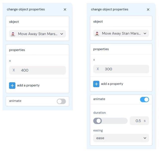
Instead, you can ask the element to go to a specific position when the page loads
This is done by
- Creating an interaction
- Selecting the “change object properties” block
- Opening the “choose a property” panel and selecting “x” (for horizontal movement, or “y” for vertical)
- Changing the value from the current position to the desired position.
*example: changing the current x position of 400 to 300
This works because when the page is reloaded the element is already at the desired position, so nothing changes.
1 Like
Here is a remixable project that shows this in action. I’ve also included an somewhat advanced method for centering the object when the page loads
1 Like
Two
Hatch is working on responsiveness at the time of this reply (May 28, 2024). The current work will render much of this obsolete, which is great as the current experience leads to questions without great answers 
Currently, pages have a “viewport fit” setting that dictate how the size and shape of your page fits to the size and shape of the screen it is being displayed on.
The options are:
-
fixed - The top left corner of your page is pinned to the top left corner of the browser window. If your browser isn’t wide enough or long enough to fit the content then the content will need to be scrolled to. Nothing is shrunk to fit into the window, either horizontally or vertically, and nothing is centered.
-
scale to fit - every thing is scaled down to fit the page in the window. The page is scaled to fit the longer dimension (height or width) to the viewport. Unless your browser window is the same shape of the page, you will see empty space where there is no page content to display. You will see empty space above and below the page when the width is fit to the viewport and the page height is not great enough to fill the viewport.
-
mobile safe (vertical) [this is the default setting] - the width of the page is fit to the viewport. If the page is longer than the viewport you scroll vertically to access the page content you cannot see. As with “scale to fit”, if your page height is less than the viewport height after fitting the page width, you will see empty space above and below the page content.
-
mobile safe (horizontal) - the height of the page is fit to the viewport and you have to scroll horizontally (left and right) to access any content that doesn’t fit into the viewport after fitting the height of the page to the viewport.
None of these options do what you want: which I read to be "keep the top of my page at the top of the viewport and let people scroll down to see the rest, regardless of the height of my page.
TL/DR The only solution I can offer at the moment is to keep the page viewport fit setting on the default “mobile safe (vertical)” and set the height of your page to at least two times the width.
Changing the page height
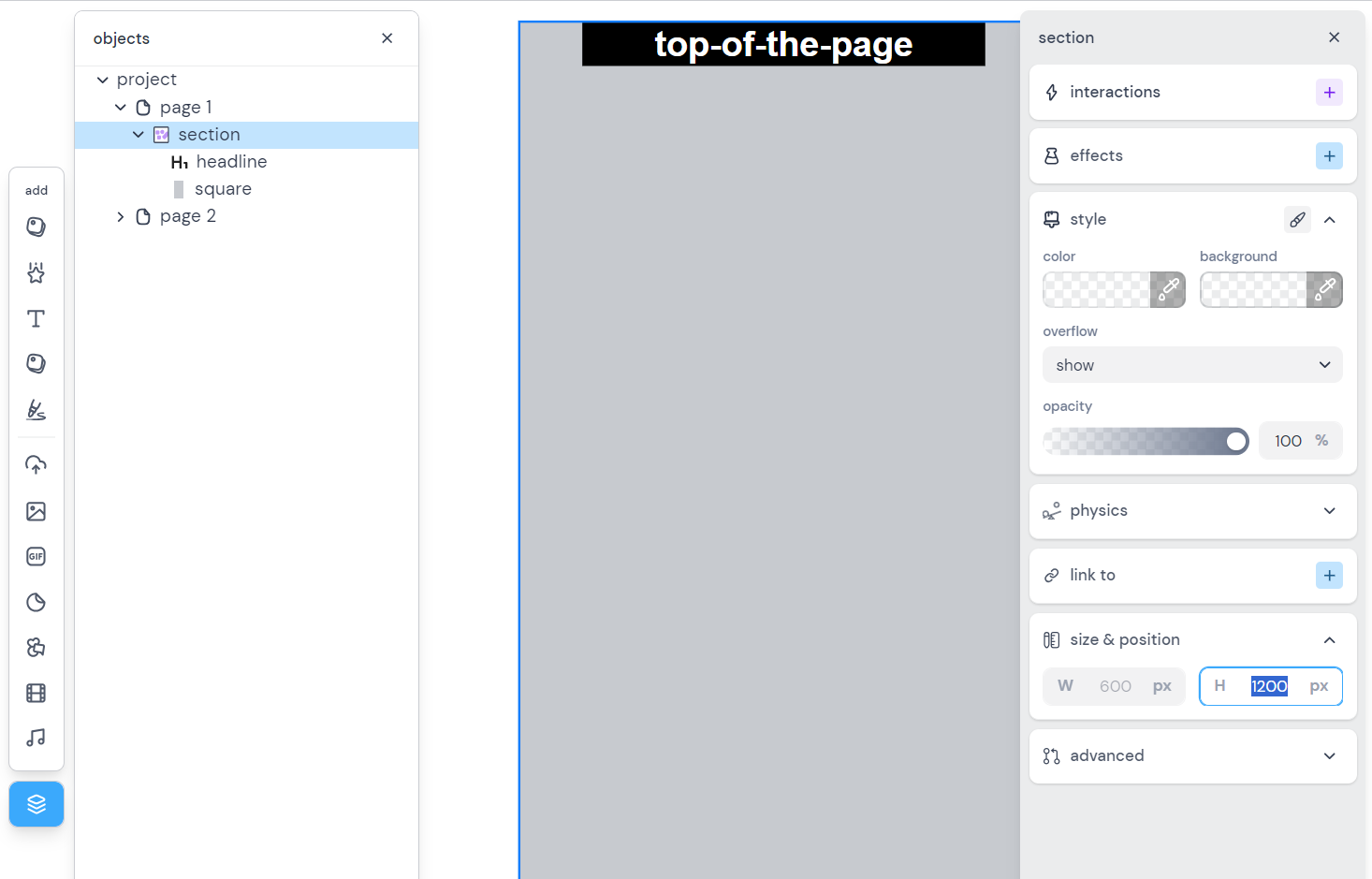
As mentioned we are in the midst of reworking how responsiveness works. Soon all the content on your page will be in “sections” and the height of the page will be determined by the combined height of your sections. Step one of this was to migrate all the existing pages to have all their content in a section. So we are in a awkward in-between state where your content is in a section, there is only one section, and the height of your page is determined by that section’s height.
To change the height, you’ll need to open the object toolbar, click the page “section”, and edit the height on the right.
You can also just drag the bottom edge of the page down and watch the height change on the left (in the 'size & position" section of the page properties.
1 Like